Rebrand
Alana Healthcare is a women’s health care clinic that was established on the premise of building a team of dedicated healthcare professionals able to deal with all facets of women’s health. With a great team of world recognised gynaecologists, physiotherapists and naturopaths, it’s easy for them to deliver on their philosophy of ‘illuminating women’s health.” Inspired by their proximity to the ocean, the Alana brand encompasses that natural feeling, offering warmth and a raw beauty with the power of mother nature.
We’ve been working with the Alana team for a number of years across a range of assets and in that time the business has grown and changed significantly. With the decision made internally to rebrand from “Alana healthcare for women” to “Alana healthcare” in order to ensure inclusivity we used the opportunity to undertake a brand refresh to modernise it and ensure that it was timeless for many years to come as Alana continued to grow.
The refresh needed to be subtle enough so that existing clients didn’t feel like they were dealing with a new company but ensure that the key objectives were still achieved.
We updated the colours and typography of the logo as well as making the logo feel more inclusive by adjusting the circles to be in the icon and including 3 as these were initially representative of the number of directors in the business (and one had left the business).


Image guidelines
With healthcare traditionally having cold and clinical images of doctors in lab coats and surgical implements this was exactly what we wanted to avoid with the Alana brand.
The image suite used natural images of ocean based photography to compliment the team shots.
This ensured that no matter the subject matter the imagery conveyed a sense of trust and warmth as well as the raw grittiness that is life.

Typography & colour palettes
Along with the update to the logo itself we introduced a new type palette with a combination of 3 fonts to be used in different applications. This combination helped to modernise the brand while keeping the personal touch with the handwritten script font.
While keeping similarities to the existing colour palette the tones were assessed and adjusted to ensure that there was a warmth to the ocean themed palette ensuring that the blues and greens didn’t feel too clinical and instead felt very natural.


"
What can I say. It's WONDERFUL.
You've created a really strong brand aesthetic for us and captured the spirit of what we wanted. Everyone is extremely happy.
carolyn woodhead
Practice Manager


The website
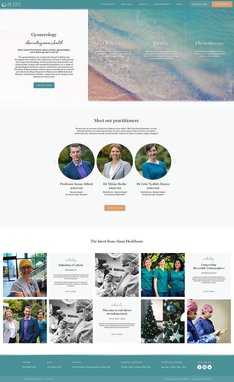
The Alana website had previously been handled by the SEO company they were using however their design capabilities were limited and were struggling to achieve the same look and feel that needed to be applied with the refresh of the brand. Alana approached us to complete and redesign and build of the site in order to ensure that the brand look and feel was consistent across all their channels. Especially as the website as such a key part of the brand.
Along with applying the new branding to the site there needed to be a rejig of the existing information to ensure that all of the very seperate services that Alana offer had equal representation on the website.
The homepage featured a different style of carousel that showed all 4 of the services at once and cycled through them to showcase them all equally.
With a large number of sub services under each of the main services we designed a menu that allowed for easy access and visibility of all sections of the site.
The site has a large amount of information so we created a range of different ways to feature content and highlight particular pieces of content.
The homepage features a “latest from Alana” section that combines blog posts & media items with instagram posts to ensure that even if nothing new has been added to the site in a while the homepage is fresh due to the instagram images.

"
I have no words... Absolute perfection.
carolyn woodhead
Practice Manager


Signage
With an expanding business offering Alana Healthcare undertook a fit out and relocation to new premises in order to better suit their needs. We helped them out with a whole range of signage including the external shopfront, light boxes and internal way finding signage using the brand elements.